The Big Issues Facing Our Next Billion Users (NBU)
Cost: Many people cannot afford expensive phones with large screens and lots of storage. UX designers and engineers can help by allowing users to temporarily disable apps to save space.
Connectivity: Users often lack constant or unlimited internet access. UX designers should enhance the offline experience to be as rich as the online one.
Digital Literacy: Some people are unfamiliar with common design patterns, calls to action, or icons. Keep designs simple and consider using video tutorials to help new users understand how to use an app.
General Literacy: Some users cannot read or type, and others may want to switch languages on their devices. Multilingual keyboards and universally understood icons can help address these issues.
Understanding your users’ context is crucial.
Designing for Offline Use
Clearly Indicate Offline Functionality: Show when an app or website can be used offline using an offline icon and the word “offline.”
Display No Functionality: When there is no internet, use a “cloud off” icon with a clear text description like “no internet.”
Allow Downloading for Future Offline Use: Show file sizes to help users decide if they want to download content. Indicate content that can be downloaded with a download icon and the file size.
Make it Easy to Delete Files: Provide a delete option with an icon and show how much space will be saved.
Transition from Downloading to Offline-Ready: Use animations to indicate download time and notify when it’s complete.
Make Offline File Location Discoverable: If offline functionality is a major feature, ensure users can easily find their offline files from the home screen.
Notify Users When Connection is Restored: Alert users when the app or content is back online.
Offline design can enhance accessibility and user satisfaction for those with limited connectivity.
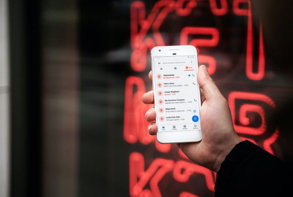
Graphical Cues and Iconography: Use icons and visual cues to help low-literate and non-native English speakers understand the UI.
Key Lessons for Building International Products
- Retrofitting May Not Always Work: Design specifically for the target market.
- Respect People’s Budgets: Design products that work on low-cost devices.
- Help Users Connect: Facilitate social connections within your app.
- Offer Offline Experiences: Ensure functionality without internet.
- Feature Locally Relevant Content: Make content relevant to the local culture and context.
Human Information Network (HIN): People often rely on each other for information like directions and recommendations.
Sideloading: Transferring files between nearby devices is common in emerging markets.
Nine Ways to Design Empathetically for Emerging Markets
- Internet Access Isn’t Guaranteed: Ensure your product works offline.
- Smaller, Simpler Devices Are the Norm: Design for older, low-end devices.
- Data is Limited: Respect users’ data budgets.
- Forget About Credit Cards: Adapt to local financial transaction methods.
- Bridge the Cultural Divide: Ensure your product fits within the local culture.
- Get Beyond Language: Use minimal text and intuitive design.
- Leverage Human Relationships: Improve or utilize the user’s social network.
- Leave Minimalism at the Door: Adapt to local visual aesthetics.
- Design for Delight: Create enjoyable experiences.
User Research: Get out of the studio and into the real world to understand how your product will be used. Talking to local residents can provide insights that reading reports cannot.
Feature Phones: These are devices that connect to the internet but lack the full capabilities of smartphones.
Payment Methods: Cash-on-delivery is common, but mobile money transfer apps like M-PESA are also popular in some regions.
Monetization: Consider what’s appropriate for the market, whether it’s through purchases, ads, or subscriptions.
Conducting User Studies: Ensure your product respects social, cultural, political, and religious norms. Consider the context of where and how it will be used.
Colors and Aesthetics: Muted colors are subtle and not bright. The minimal interface may not stand out in visually dense environments. Balance meaningfulness with the local aesthetic.
Advantages of Using Design Tools
- Prototyping and Iteration: Tools help designers prototype and refine ideas.
- Testing Prototypes: Tools make it easier to test designs.
- Collaboration: Multiple teams can work on the same product.
Wireframing and Prototyping Tools:
- Figma
- Adobe XD
- Sketch
- Framer
Presentation Tools:
- Google Slides
- Microsoft PowerPoint
- Keynote
Image Creation and Manipulation Tools:
- Adobe Illustrator
- Adobe Photoshop
Animation Tools:
- Lottie
- Adobe After Effects
Image Types
Vector Images (SVGs): Created using points, curves, and shapes to produce smooth lines.
Raster Images: Made up of thousands or millions
Best Practices for Designing Mobile User Experiences
- Call-to-Action Buttons: Place them front and center to enable users to complete tasks easily.
- Navigation Menus: Keep them short and simple.
- Intuitive Gestures: Utilize familiar gestures like tapping and swiping.
- Orientation Design: Design for both portrait and landscape orientations to ensure usability regardless of how the phone is held.
- Reduce Visual Clutter: Simplify the user experience to accommodate smaller screen sizes on mobile devices.
Designing Cross-Platform Experiences
Key Considerations
- Screen Size: Adjust design elements to fit various screen sizes.
- Interaction: Consider how users interact with each platform, including the use of accessibility tools like screen readers and switch devices.
- Content Layout: Organize information differently based on the device—portrait for mobile, landscape for desktops and laptops, and a mix for tablets.
- Functionality: Tailor the functionality to the strengths of each platform, such as intensive tasks on desktops and casual tasks on mobile phones.
The Four Cs of Cross-Platform Design
- Consistency: Follow design guidelines to maintain brand identity across platforms.
- Continuity: Ensure a seamless experience as users transition between platforms, preserving their progress.
- Context: Consider how and when users interact with features on different platforms.
- Complementary: Each platform should add unique value to the user experience.
Assistive Technology (AT)
Assistive technology includes products, equipment, and systems that enhance learning, working, and daily living for people with disabilities. Key types of AT include:
- Color Modification: High contrast or dark modes to increase color contrast for better visibility.
- Voice Control and Switch Devices: Help people with limited dexterity by allowing navigation through voice commands or alternative input methods.
- Screen Readers: Read aloud on-screen text and interactive elements for users with limited vision.
- Alternative Text (Alt Text): Describes images in words to assist those who cannot see the images and helps users with low bandwidth connections.
Benefits of Assistive Technology
Assistive technology benefits not only individuals with disabilities but also those with temporary impairments or situational challenges. For instance, voice control can assist someone with a temporary injury, and alt text can help users with slow internet connections.
By incorporating these best practices and considerations into your design process, you can create more inclusive and effective user experiences across different platforms and for diverse user needs.