• Why does designing accessible products and services matter?
  • What are some common types of impairments and disabilities?
  • What are some ways I can design and test to improve accessibility?

Since the first store, which probably sold sticks to fight off pterodactyls, businesses have hoped to sell their goods and services to as many people as possible.

But since no two people are the same, it’s good to consider making your business more accessible, including for people with an impairment or disability. Fortunately, improving accessibility can help all of your customers.

In fact, you probably use items designed for accessibility every day without thinking about it. Let’s see if you can spot some examples of accessibility features that may have wide-ranging benefits.

People may not realize how often they use accessibility features. Whether people are pushing strollers up ramps, using captions to watch movies on public buses, waiting for important calls during meetings, or using a website, accessibility may benefit everyone.

When considering accessibility, it helps to understand impairments. There’s a wide range, but many fall into 4 categories.

There are visual impairments, which cover a variety of disabilities, including low vision, blindness, colour blindness – even the inability to see a laptop on a sunny day.

There are motor impairments, such as a repetitive stress injury (or RSI) that makes clicking a mouse painful. There are also physical disabilities that may prevent people from using a touchscreen, a set of stairs, or a doorknob.

Hearing impairments can be anything from being profoundly deaf to trying to hear someone on the other end of the phone from inside the pit at a death metal concert.

And there are cognitive impairments like Dyslexia and Attention-Deficit Disorder, which can affect how people take in and understand the content.

Accessibility can cover many aspects of a business, from how you set up your store to how you create marketing videos. So, when thinking about making your business more accessible, it can help to consider one of the first things your customers will likely see: your website.

To make your website more accessible, it can help to list out the ways that customers might interact with your business (AKA their use journeys).

Start with the primary actions your customers need to take to use your site. So if you’ve got an online store, a customer’s primary actions might include adding items to their online shopping carts.

Next, consider secondary actions, which can enhance users’ experiences without being necessary to use your site. For example, if you run a news site, you might let users make profiles without requiring that they have one to read articles.

Once you know your primary and secondary actions, you can go through them and identify what could be made more accessible.

As you evaluate your site, consider if your content is:

  • Receivable: can people know that your content exists with more than one sense?
  • Understandable: can users take in and comprehend the information in a variety of ways?
  • Operable: can users interact with and navigate your website?
  • Robust: can people access your site using various browsers, operating systems, and assistive tools?

Website content comes in many forms: product details, blog posts, etc. but it may only be useful if visitors know the content’s there –  if it’s perceivable.

To make your design more accessible, ask yourself if the content is perceivable in multiple ways or by multiple senses. That way, it’s accessible to more people, including those who may have an impairment.

Having a strong contrast between background and foreground colours on your website can also be key to having perceivable content. Many companies make contrast checkers you can use to see how your site measures up.

It’s also important not to rely solely on colour to convey information. Let’s say you highlight text that links to another webpage in blue. underline it, too, so people don’t miss it.

Making something more accessible also means ensuring it’s operable: that people can interact with it in different ways.

For example, some people with motor impairments may navigate websites using only keyboard commands, like “Tab” key. So you might test how using that key will help people navigate through the site (AKA the tab order).

Consider having the tab order mirror how you want people to read the page (generally top to bottom) and having the most important stuff higher in the order. This can help make it efficient for keyboard users to navigate to what matters.

But, again, say you have a news site. Tabbing through all the articles and sections could be a pain for someone who just wants a restaurant review. So consider giving users ways to move through info quickly and access what they want more easily.

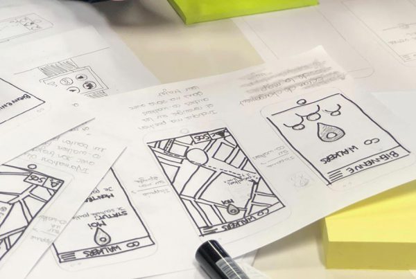
Creating a mockup of your website that you can try to navigate through and use while you’re still in the planning phase can help you identify the intended tab order. Consider sharing it with developers and quality assurance testers.

So, you’ve improved the ability to perceive and navigate through your website. But is everything understandable?

Consider clarity and consistency. Clearly labelled entry fields, easily recognizable icons, thorough instructions, and error messages that spell out what went wrong can make your website easier to use.

You’ll also want to consider giving images “alt text”.  This is a descriptive copy written into the back end of a website. Screen reader technology can read this copy aloud to help visually impaired users understand the images on the webpage.

For example, say your website has a picture of your brand new store with an “Open for business” sign. The alt text could read, “our new store on Broadway is now open”. This helps people know what you wish the image to communicate.

As you make your website work for more users, you also want it to be robust enough to work with a variety of browsers and assistive technologies.

An important part of making a robust site is labelling anything interactive: text-input fields, icons, etc. say your site has a navigational icon. You might give it a label for screen readers to use that says “show/hide navigation menu”.

If you’re creating labels, remember: be brief and go heavy on action verbs. That way, rather than hearing long descriptions, people using assistive tools like screen readers can focus on what to do.

Also, if your site has text links, try and make the copy descriptive, like, “Go to your shopping cart,” rather than just, “Click here.” Screen reader users can get more out of knowing where links navigate to.

Once you’ve worked to make your website more accessible, it’s time to check whether it’s going to work for many people.

There are web extensions you can use to get a report on your site, like Google Chrome’s Lighthouse. It’ll run about 30 accessibility tests. If there’s a failure, you’ll be linked to a doc that suggests how to fix the issue.

But these extensions can miss a lot of things. So it’s helpful to sit down and observe actual people using your website. Be sure to ask a wide range of potential users, since accessibility is about making everyone’s experience better.

Consider conducting these tests every step of the way, too. It’ll help you from going too far down the creation process with something that may not work for some people.

And think about giving your team accessibility training and online resources. Encourage them to build with accessibility in mind, so you can reach as many customers as possible.

Simple, direct alt text and labels are important for accessibility. If you’ve installed an accessibility checker, let’s look at your website – or a site you like -and see how you think the alt text and labels perform.

If you evaluate your own site, go through the alt text and labels for the images, icons, and entry fields, and make them direct and actionable as this may help users get the most out of your site.

References: Google Webmasters, Think With Google, Google Primer