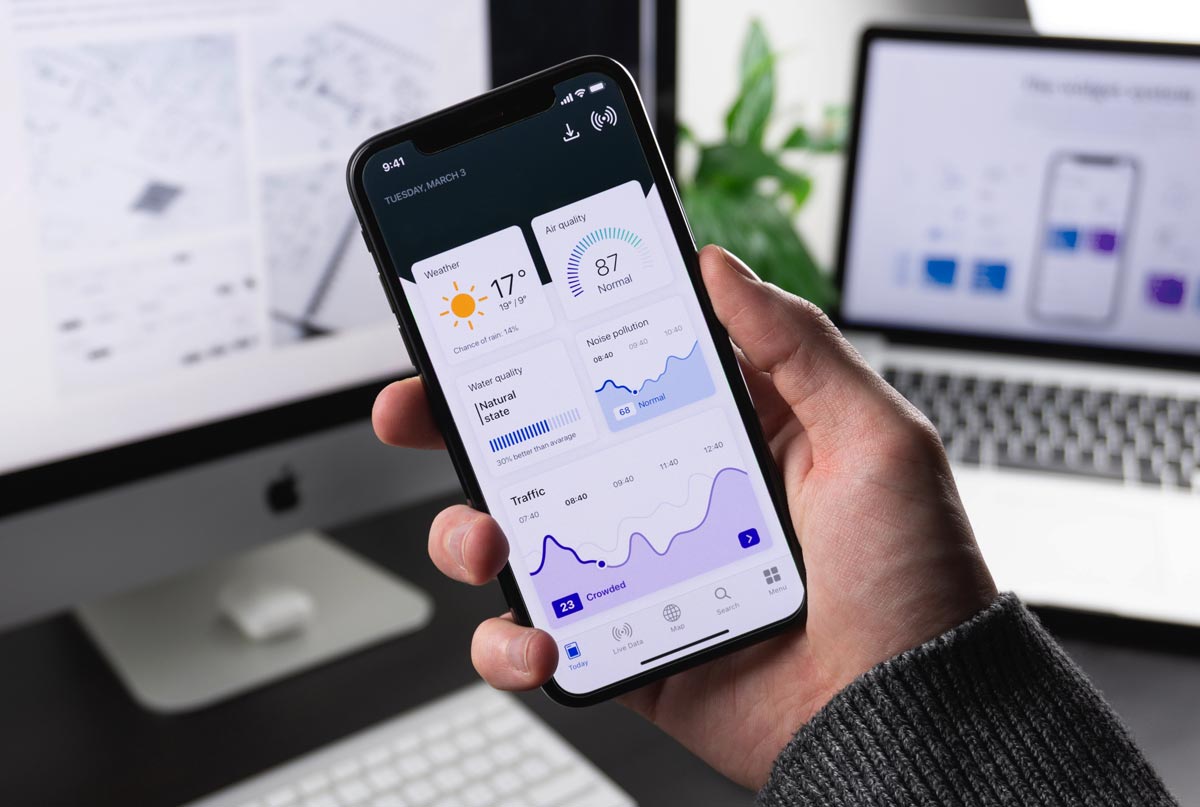
Do I Really Need a Mobile Site? Yes, you absolutely need a mobile site. In today’s world, people often browse the internet on their phones. Imagine a group of friends at lunch. One of them talks about a cool kitchenware store called Kitsch Kettle. Everyone pulls out their phones to check out the store’s website. If the site isn’t mobile-friendly, they might get frustrated and leave.
What Should I Know When Using a Designer or Agency?
When you hire a designer or agency, make sure they understand the importance of mobile design. Here are some key points to discuss:
- Mobile-First Design: Start with the mobile version before creating the desktop version.
- Responsive Design: Ensure your site adjusts to different screen sizes and devices seamlessly.
- User Experience: Focus on easy navigation, quick load times, and a simple checkout process.
How Can I Improve My Mobile Site Design?
Here are some tips and trends to enhance your mobile site design:
1. Responsive Design is Key
Responsive design means your site looks good on any device, whether it’s a phone, tablet, or desktop. This approach makes navigation seamless and keeps your customers engaged.
2. Clear Call-to-Actions (CTAs)
Place your CTAs where they are easily visible. Make sure they stand out and guide users towards making a purchase.
3. Simplify Navigation
- Short, Simple Menus: Use concise menus. For example, a single “Women” category instead of multiple sub-categories.
- Vertical Menus: Vertical menus are more mobile-friendly than horizontal ones.
- Logo Navigation: Clicking the logo should always take users back to the homepage.
4. Optimize for Search
- Search Box Placement: Place the search box at the top of the page.
- Auto-Complete and Auto-Correct: These features help users find what they’re looking for quickly.
- Filter Options: Allow users to filter search results by size, color, style, etc.
5. Streamline the Purchase Process
- Guest Checkout: Allow users to check out without creating an account.
- Pre-Fill Information: For returning customers, pre-fill their preferences and details.
- Third-Party Checkout: Enable options like PayPal or Apple Pay for quick transactions.
6. Enhance Form Usability
- Numeric Keypads: Use numeric keypads for fields requiring numbers.
- Visual Calendars: Provide visual calendars for date selections.
- Auto-Advance Fields: Automatically move to the next field after one is completed.
- Error Checking: Validate form entries in real-time to catch mistakes early.
Evaluate Your Mobile Site
Use these questions to evaluate your mobile site or a competitor’s:
- Is there a clear call to action? Yes/No/I don’t know
- Is there a search box at the top of the page? Yes/No/I don’t know
- Do promotions compete with navigation or CTAs? Yes/No/I don’t know
- Does clicking the logo return you to the homepage? Yes/No/I don’t know
- Can you check out as a guest? Yes/No/I don’t know
- Does the site alert you if you forgot to enter your zip code? Yes/No/I don’t know
Conclusion
Discuss any issues you find with your designer to improve your mobile site. A well-designed mobile site can significantly boost your conversions and user satisfaction.


